Connecting the Home, the Business, and the Systems Behind Them
AVL is a home automation, security, and networking company. Its work sits behind the walls and interfaces of modern spaces: smart homes, surveillance systems, Wi-Fi networks, audio/video setups, lighting control, and the infrastructure that lets those systems work together.
I worked with AVL from its early public-facing stage, beginning with its first website and later developing a fuller brand identity, website system, and brand documentation. A few years later, the company wanted to move away from its original blue-led identity toward a darker black direction. I handled that transition as well, extending the updated look into brochures, manuals, apparel, and smaller brand applications.
Across those stages, the central idea was connection. AVL’s work is about making separate systems behave as one environment. The brand needed to express that clearly without making the company feel overly technical or generic.
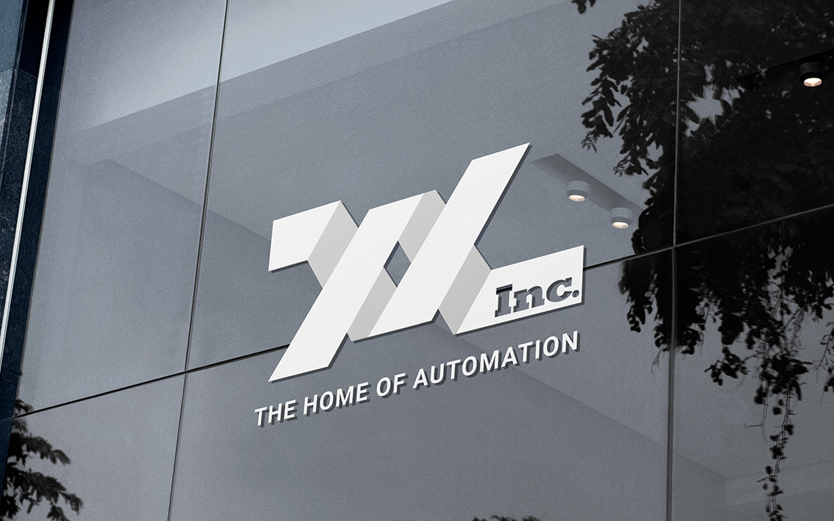
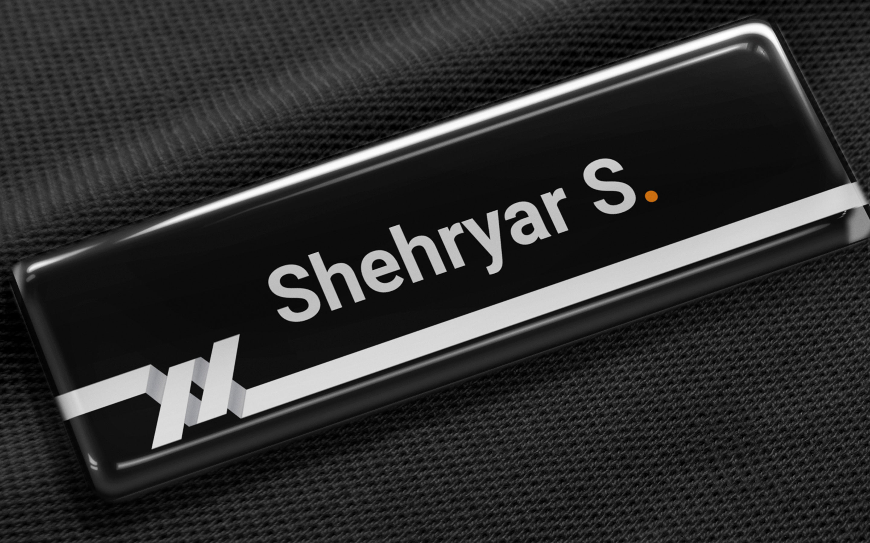
Turning connection into an identity.
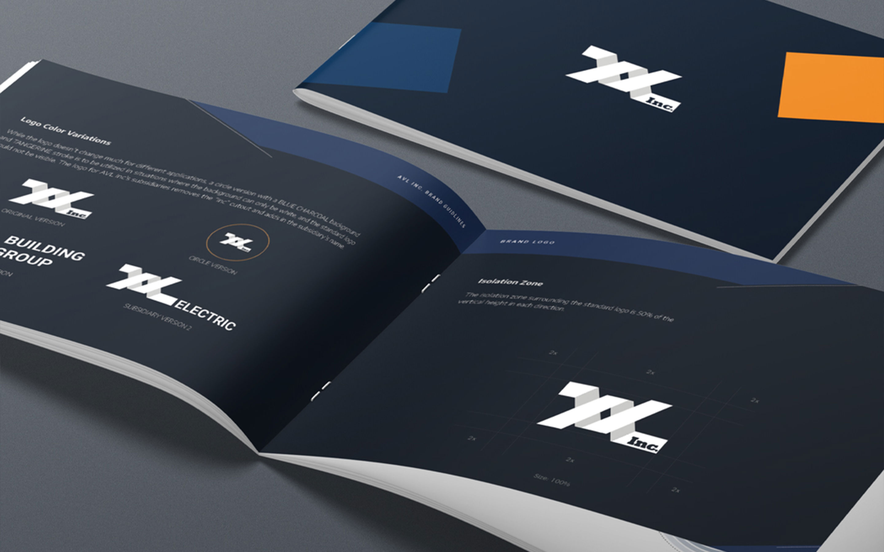
The full identity expanded the idea of connection into a visual language. The logo, colour system, typography, and guidelines were built around the feeling of linked components and integrated systems.
The original blue palette gave the brand a technology-driven tone. It supported a company working with security, networking, and automation, while keeping the identity approachable enough for residential clients.
The brand guidelines helped make the system more repeatable. They gave AVL rules for logo use, colour, spacing, and application, turning the identity into something that could hold together across digital, print, and field-facing material.
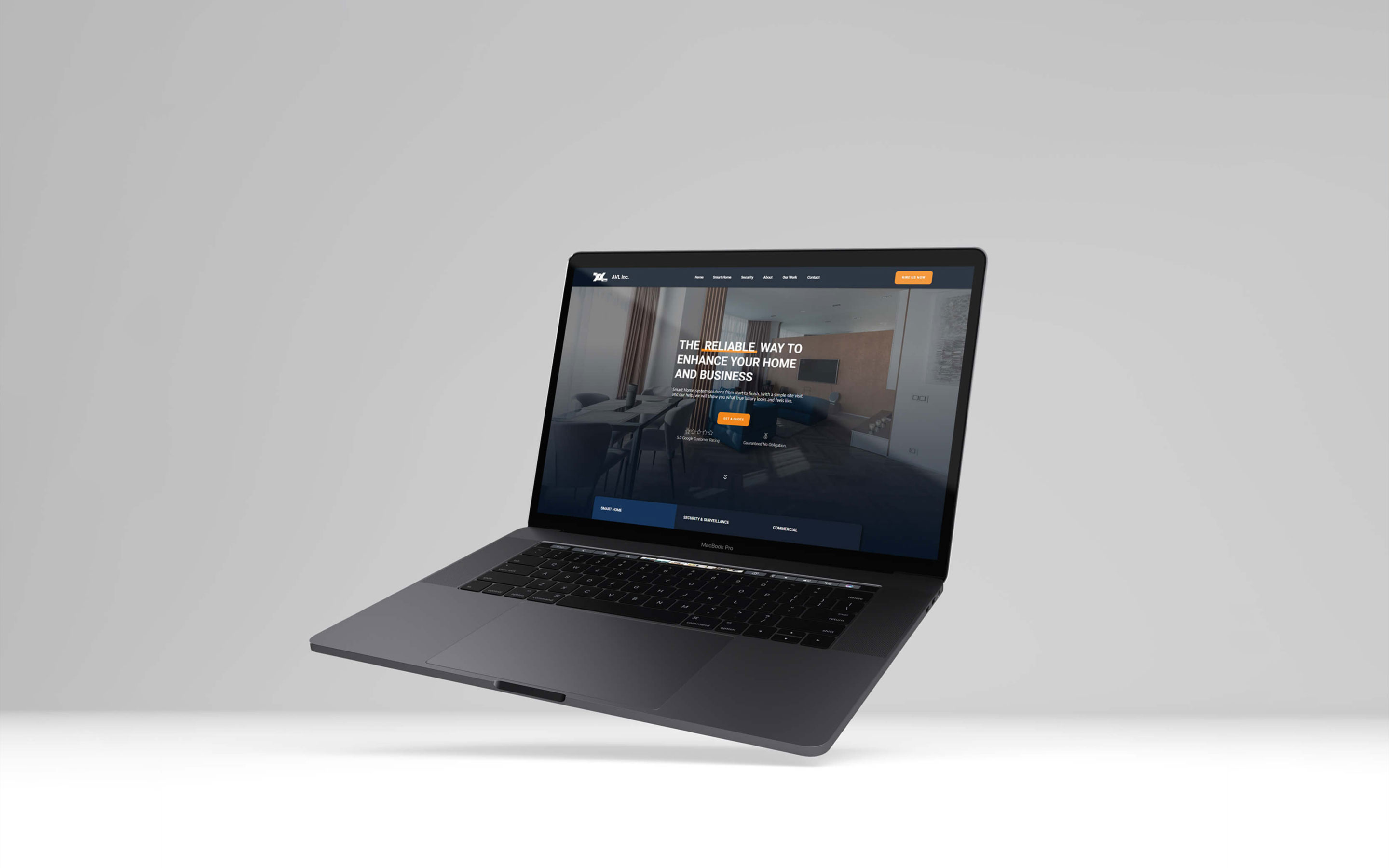
A website for invisible work.
The new website became the clearest expression of the brand. It organized AVL’s services around the way clients experience them: smart home, security and surveillance, commercial systems, and connected infrastructure.
AVL’s work is often invisible when it is done well. Clients may never think about the wiring, configuration, or backend logic. They notice that the camera works, the network holds, the theatre responds, and the space feels easier to control. The site needed to make that hidden value tangible. It gave the company a more polished digital presence, clarified the service offer, and positioned AVL as a reliable partner for connected spaces.
A sharper expression for the next stage.
A few years later, AVL wanted to shift its main colour from blue to black. The change gave the identity a more premium and assertive tone while keeping the core brand logic intact. The black refresh did not require a new concept, the idea of connection still held. The update was about changing the atmosphere of the brand so it felt more mature and better aligned with the company’s current direction.
The refreshed identity carried into new collateral, including brochures, manual documents, apparel, and smaller field-facing applications. These pieces helped the brand feel more consistent in the places clients encountered it: during sales, onboarding, installation, and service.
From the journal
Don't Treat Launch as the Finish Line
Jan-Philip Radde
May 21, 2026
6 min
Don't Treat Launch as the Finish Line
The common expectation of design is that things should last forever. They should be solid and resist the natural decay that affects everything. We are trained to design against time, aiming for a fixed state. When a client approaches a studio, mine or anyone else's, the instinct is to forge something immutable, a digital monument. That is the wrong instinct, we must design for change, the only constant is change. Climate, technology, geopolitical dynamics, and, most importantly, the user's needs, they are all in relentless flux. To design for permanence is to create an immediately outdated product, one that is perfectly suited to yesterday’s conditions and becomes increasingly obsolete with every passing hour. We need to shift our design approach. Instead of creating static artifacts, we should be curating dynamic systems. Our focus should be on longevity achieved not through resistance, but through adaptability.
Working with Trades: Bridging the Gap Between Design and Craft
Jan-Philip Radde
May 21, 2026
3 min
Working with Trades: Bridging the Gap Between Design and Craft
In the world of graphic and web design, collaboration is at the heart of every successful project. Yet, when designers and tradespeople come together, there’s often an invisible wall built from years of assumptions, miscommunications, and missed opportunities. Having worked across disciplines and industries, I’ve seen firsthand how these barriers can be transformed into bridges if both sides are willing to listen, learn, and translate.
Understanding the Divide:
Designers and trades have long held certain perceptions about each other. Designers may see trades as rigid or overly practical, while trades might view designers as abstract or disconnected from the realities of building and making. These stigmas are rarely accurate, but they persist because both sides speak different languages, one rooted in abstract aesthetics and vision, the other in pragmatic materials and execution.
The Power of Translation:
The trades operate on efficiency, trust, and tangibility. Our designs must reflect those same core values, but through a different medium. When a designer talks about "visual hierarchy," the translation for a builder is "clear, immediate identification of critical information." When we discuss "negative space," the conversation should shift to "clarity" and "reduction of mental load," the immediate ability of a potential client to locate the service or product they need without unnecessary friction.
This translation isn’t about compromise; it’s about synthesis. It’s about finding the intersection where design vision meets practical expertise. When both sides are invested in the outcome, the result is work that is not only beautiful but also functional, durable, and innovative.
Communicating Value:
One of the most important aspects of working with trades is communicating the value of design. Instead of justifying or defending your work, focus on clearly showcasing its tangible value. Show how thoughtful design can make a process more efficient, a product more desirable, or a space more intuitive.
Mutual Benefit and Opportunity:
When designers and trades collaborate effectively, the benefits are real and measurable. Projects run more smoothly, budgets are respected, and the end product often exceeds expectations. More importantly, these partnerships can open up new avenues for business and creativity. Trades gain access to new markets and ideas, while designers learn to ground their visions in reality, making their work more impactful.
Moving Forward Together:
The future of design is collaborative. By breaking down the old stigmas and focusing on translation and communication, designers and trades can create work that is greater than the sum of its parts. The process becomes not just lucrative but deeply rewarding for everyone involved.
The Discipline of Constraint: Quality Design on a Lean Budget
Jan-Philip Radde
May 21, 2026
6 min
The Discipline of Constraint: Quality Design on a Lean Budget
In the design industry, the low-budget client is often regarded with a certain dread, a potential vector for scope creep, compromised aesthetics, and ultimately, a dilution of a studio's core quality standards. This perspective is understandable, yet fundamentally flawed. It presupposes that financial constraint is inherently antithetical to design excellence. It is not. It is merely a specific, potent form of constraint, and constraint, properly leveraged, is the engine of genuine innovation. Decoding the Scope: The Essential vs. The Superficial: The first and most critical step when engaging a low-budget project is the absolute clarity of scope. High-budget projects often tolerate a certain degree of feature bloat or aesthetic indulgence. A lean budget provides no such margin. We must immediately strip the project down to its functional core.


.jpg)