In the design industry, a Friday afternoon call usually means one of two things: a launch went wrong, or an impossible deadline just materialized. For Better Mortgage Select, it was the latter. They needed a massive, large-scale trade show booth designed, finalized, and sent to the printers by Monday morning.
They had an existing mock-up provided by an external designer, but the execution was poor. I could have just cleaned up their messy file and hit "export," but a trade show floor is an unforgiving environment. I decided to scrap the original file and build a modular environmental design from scratch.
Cutting Through the Floor Noise
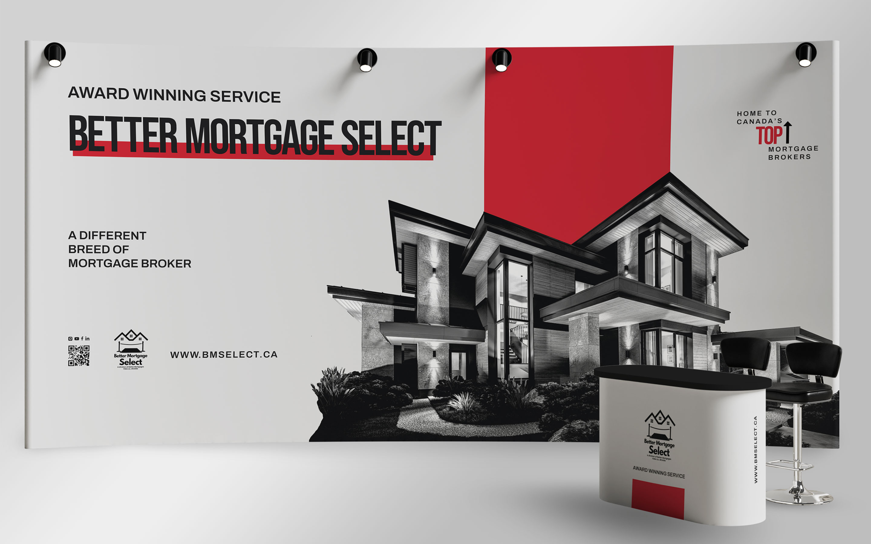
Trade shows are chaotic. Brands compete with harsh lighting, dense crowds, and dozens of competitors screaming for attention. To solve this, I looked at Better Mortgage Select’s most effective existing touchpoint: their bold, high-contrast social media presence. I translated that Instagram energy into a physical space. Using grayscale home imagery to ground the booth in professionalism, I applied aggressive red geometry and stark typography to carry attention from across the room. If a prospect can’t read the core message from fifty feet away, the booth has failed.
The Three-Way Split
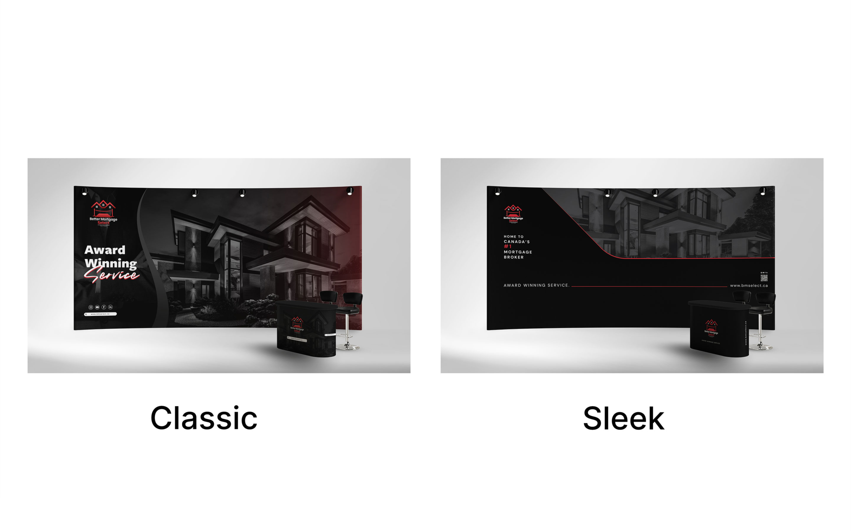
Because of the tight turnaround, there wasn't time for a prolonged revision cycle. I had to get it right on the first presentation. Instead of giving the client one option to critique, I reverse-engineered their original reference material into three distinct strategic directions: Classic (a polished update to their original idea), Bold (a high-contrast, aggressive digital translation), and Sleek (a stripped-back, premium execution). This gave the client immediate flexibility to choose their exact market posture without burning hours on revisions.
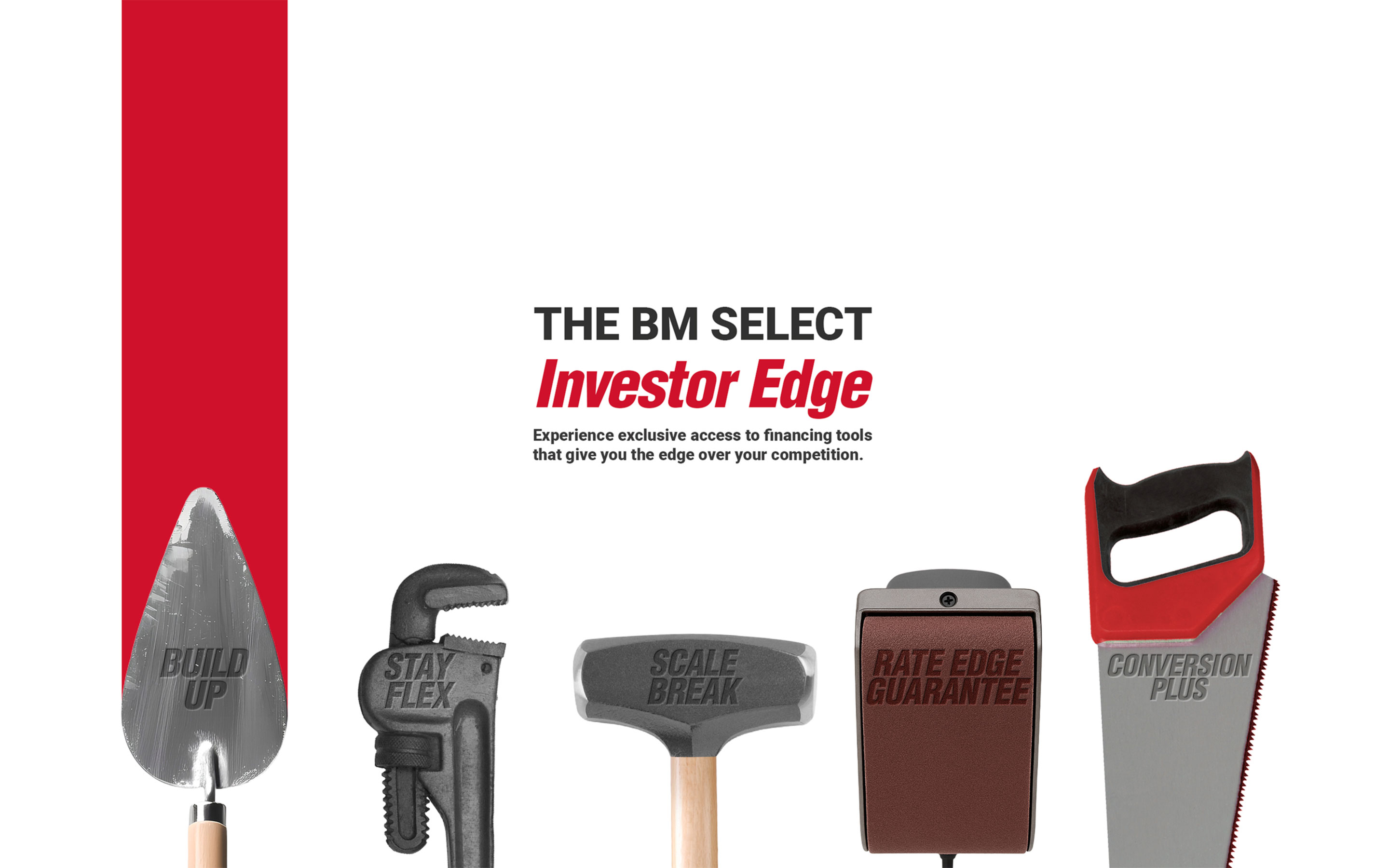
The Investor Edge Campaign
Following the success of the trade show execution, the client brought me back to design the visual campaign for their "Investor Edge" program. The challenge was explaining complex financing stages without resorting to dense financial jargon.
I developed a visual toolkit, distilling five distinct financing stages into literal, recognizable tool metaphors. By isolating these tools in a stark, minimal layout, I created a campaign that was instantly comprehensible, heavily branded, and highly scalable across digital, print, and event spaces.
The Impact
Real-world design is forged by its constraints. The pressure of a weekend sprint and the chaos of the trade show floor dictated every visual decision made. By prioritizing extreme legibility and a bold hierarchy, a tight deadline turned into a dominant physical presence that drove foot traffic, facilitated leads, and cemented Better Mortgage Select as an authority in a crowded room.
From the journal
Don't Treat Launch as the Finish Line
Jan-Philip Radde
May 21, 2026
6 min
Don't Treat Launch as the Finish Line
The common expectation of design is that things should last forever. They should be solid and resist the natural decay that affects everything. We are trained to design against time, aiming for a fixed state. When a client approaches a studio, mine or anyone else's, the instinct is to forge something immutable, a digital monument. That is the wrong instinct, we must design for change, the only constant is change. Climate, technology, geopolitical dynamics, and, most importantly, the user's needs, they are all in relentless flux. To design for permanence is to create an immediately outdated product, one that is perfectly suited to yesterday’s conditions and becomes increasingly obsolete with every passing hour. We need to shift our design approach. Instead of creating static artifacts, we should be curating dynamic systems. Our focus should be on longevity achieved not through resistance, but through adaptability.
Working with Trades: Bridging the Gap Between Design and Craft
Jan-Philip Radde
May 21, 2026
3 min
Working with Trades: Bridging the Gap Between Design and Craft
In the world of graphic and web design, collaboration is at the heart of every successful project. Yet, when designers and tradespeople come together, there’s often an invisible wall built from years of assumptions, miscommunications, and missed opportunities. Having worked across disciplines and industries, I’ve seen firsthand how these barriers can be transformed into bridges if both sides are willing to listen, learn, and translate.
Understanding the Divide:
Designers and trades have long held certain perceptions about each other. Designers may see trades as rigid or overly practical, while trades might view designers as abstract or disconnected from the realities of building and making. These stigmas are rarely accurate, but they persist because both sides speak different languages, one rooted in abstract aesthetics and vision, the other in pragmatic materials and execution.
The Power of Translation:
The trades operate on efficiency, trust, and tangibility. Our designs must reflect those same core values, but through a different medium. When a designer talks about "visual hierarchy," the translation for a builder is "clear, immediate identification of critical information." When we discuss "negative space," the conversation should shift to "clarity" and "reduction of mental load," the immediate ability of a potential client to locate the service or product they need without unnecessary friction.
This translation isn’t about compromise; it’s about synthesis. It’s about finding the intersection where design vision meets practical expertise. When both sides are invested in the outcome, the result is work that is not only beautiful but also functional, durable, and innovative.
Communicating Value:
One of the most important aspects of working with trades is communicating the value of design. Instead of justifying or defending your work, focus on clearly showcasing its tangible value. Show how thoughtful design can make a process more efficient, a product more desirable, or a space more intuitive.
Mutual Benefit and Opportunity:
When designers and trades collaborate effectively, the benefits are real and measurable. Projects run more smoothly, budgets are respected, and the end product often exceeds expectations. More importantly, these partnerships can open up new avenues for business and creativity. Trades gain access to new markets and ideas, while designers learn to ground their visions in reality, making their work more impactful.
Moving Forward Together:
The future of design is collaborative. By breaking down the old stigmas and focusing on translation and communication, designers and trades can create work that is greater than the sum of its parts. The process becomes not just lucrative but deeply rewarding for everyone involved.
The Discipline of Constraint: Quality Design on a Lean Budget
Jan-Philip Radde
May 21, 2026
6 min
The Discipline of Constraint: Quality Design on a Lean Budget
In the design industry, the low-budget client is often regarded with a certain dread, a potential vector for scope creep, compromised aesthetics, and ultimately, a dilution of a studio's core quality standards. This perspective is understandable, yet fundamentally flawed. It presupposes that financial constraint is inherently antithetical to design excellence. It is not. It is merely a specific, potent form of constraint, and constraint, properly leveraged, is the engine of genuine innovation. Decoding the Scope: The Essential vs. The Superficial: The first and most critical step when engaging a low-budget project is the absolute clarity of scope. High-budget projects often tolerate a certain degree of feature bloat or aesthetic indulgence. A lean budget provides no such margin. We must immediately strip the project down to its functional core.


.jpg)