DMF began as Kysean’s phrase: Don’t Move Fake. More than a tagline, it functioned like a personal code, a statement about authenticity, loyalty, and how someone chooses to carry themselves.
My role was to turn that phrase into a visual system that could hold up across music, apparel, and release-specific merchandise. The work started with a logo, then expanded into a basics line and song-specific merch concepts designed to feel connected to the artist. The brand did not need to explain authenticity. It needed to carry it with enough restraint that the person wearing it felt like they were inside the code, not advertising it from the outside.
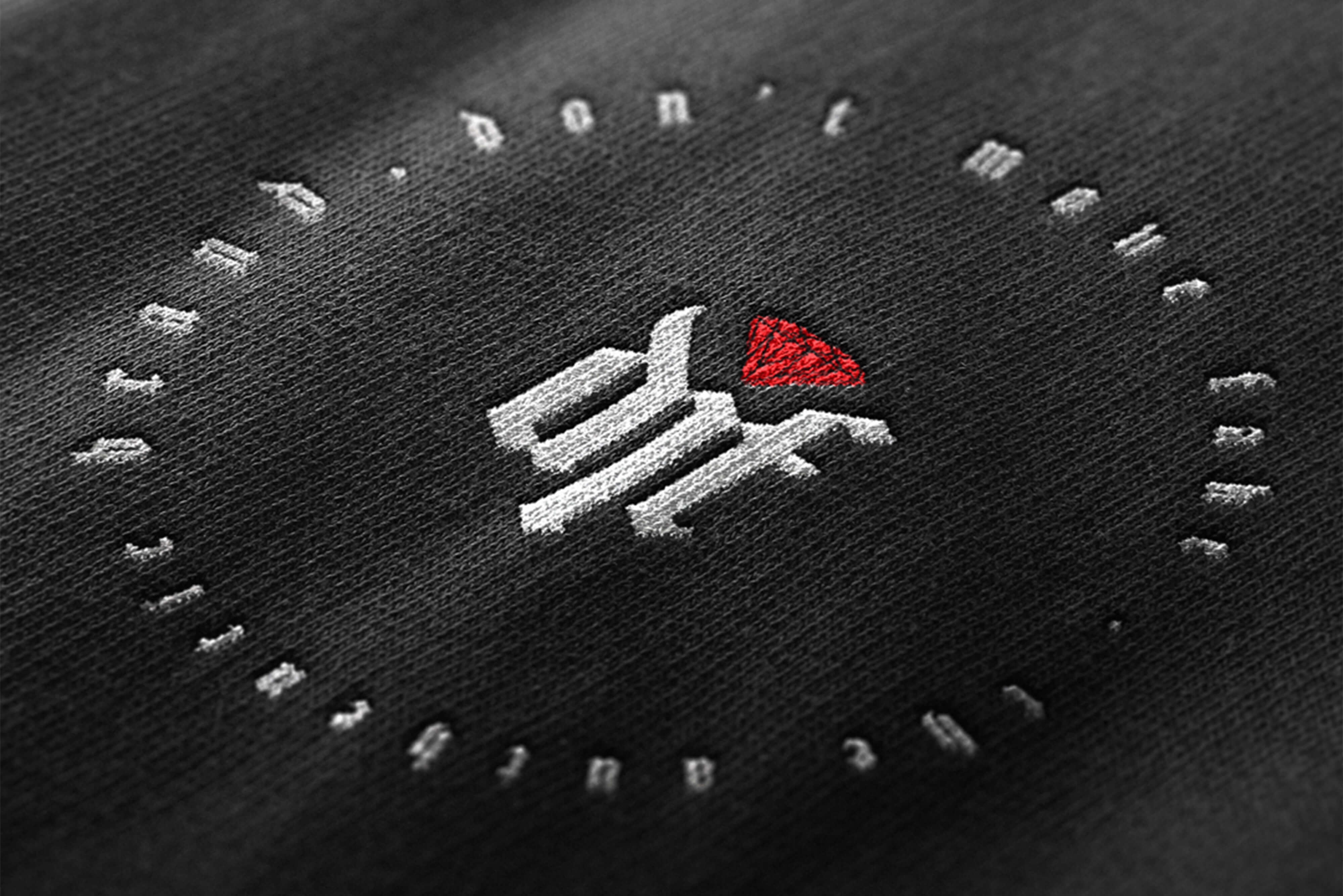
The Mark
A signature for the brand.
The DMF logo was designed as a compact mark that could move between artist identity and apparel. It needed to work small, especially on chest placements, embroidery, and later even skin, while still carrying enough character to be recognized. The red accent gives the mark a point of tension. It breaks the black-and-white system without taking over the garment. Used at the right scale, the logo is meant to feel less like a graphic and more like a signature.
The Basics Line
Clothing for people inside the world.
The basics line translated DMF into everyday pieces. Hoodies and tees became the main canvas, with simple placements and controlled details. The strongest pieces use the phrase with restraint, that approach made the clothing feel more personal. DMF became something worn by people who understood the phrase, not just people who recognized the artist.
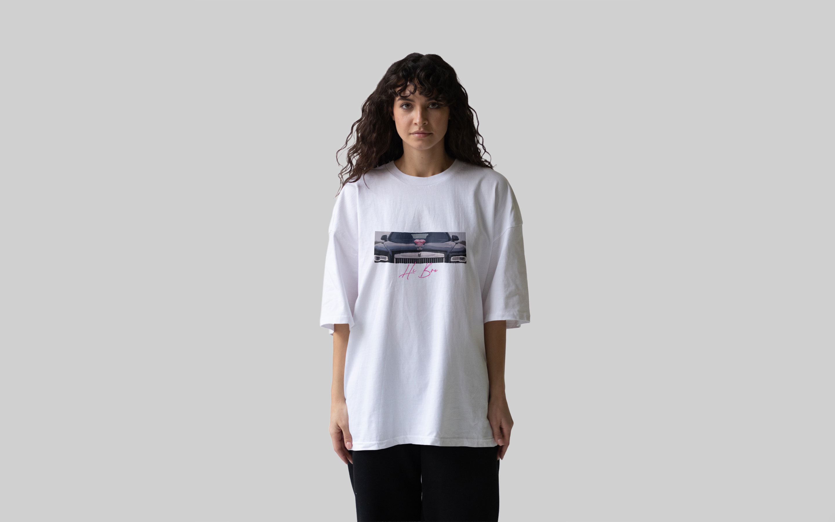
Release Merch
Songs as visual chapters.
Later concepts explored how DMF could extend around specific releases. Each song became a chance to build a small visual chapter around Kysean’s world. The goal was to avoid treating merch as a flat souvenir. A release could carry its own tone, symbol, or phrase while still feeling connected to the larger DMF system. This gave the brand more range. The core identity stayed consistent, while each drop could shift in mood.
The work was in the restraint.
The project gave DMF a visual identity that could extend beyond one logo or one release. It created a mark, a tagline relationship, a basics direction, and a flexible approach to song-specific merch. The brand can now live in two worlds at once: as part of Kysean’s artist identity and as a clothing language with its own attitude. DMF could have gone loud very easily. The name already has pressure in it. The stronger move was to let the identity feel controlled.
The logo, apparel, and merch concepts were built around that control. Small marks. Sharp placement. Limited colour. Enough detail to feel intentional, without making the clothing feel overperformed. That restraint is what gives DMF its credibility.
From the journal
Don't Treat Launch as the Finish Line
Jan-Philip Radde
May 21, 2026
6 min
Don't Treat Launch as the Finish Line
The common expectation of design is that things should last forever. They should be solid and resist the natural decay that affects everything. We are trained to design against time, aiming for a fixed state. When a client approaches a studio, mine or anyone else's, the instinct is to forge something immutable, a digital monument. That is the wrong instinct, we must design for change, the only constant is change. Climate, technology, geopolitical dynamics, and, most importantly, the user's needs, they are all in relentless flux. To design for permanence is to create an immediately outdated product, one that is perfectly suited to yesterday’s conditions and becomes increasingly obsolete with every passing hour. We need to shift our design approach. Instead of creating static artifacts, we should be curating dynamic systems. Our focus should be on longevity achieved not through resistance, but through adaptability.
Working with Trades: Bridging the Gap Between Design and Craft
Jan-Philip Radde
May 21, 2026
3 min
Working with Trades: Bridging the Gap Between Design and Craft
In the world of graphic and web design, collaboration is at the heart of every successful project. Yet, when designers and tradespeople come together, there’s often an invisible wall built from years of assumptions, miscommunications, and missed opportunities. Having worked across disciplines and industries, I’ve seen firsthand how these barriers can be transformed into bridges if both sides are willing to listen, learn, and translate.
Understanding the Divide:
Designers and trades have long held certain perceptions about each other. Designers may see trades as rigid or overly practical, while trades might view designers as abstract or disconnected from the realities of building and making. These stigmas are rarely accurate, but they persist because both sides speak different languages, one rooted in abstract aesthetics and vision, the other in pragmatic materials and execution.
The Power of Translation:
The trades operate on efficiency, trust, and tangibility. Our designs must reflect those same core values, but through a different medium. When a designer talks about "visual hierarchy," the translation for a builder is "clear, immediate identification of critical information." When we discuss "negative space," the conversation should shift to "clarity" and "reduction of mental load," the immediate ability of a potential client to locate the service or product they need without unnecessary friction.
This translation isn’t about compromise; it’s about synthesis. It’s about finding the intersection where design vision meets practical expertise. When both sides are invested in the outcome, the result is work that is not only beautiful but also functional, durable, and innovative.
Communicating Value:
One of the most important aspects of working with trades is communicating the value of design. Instead of justifying or defending your work, focus on clearly showcasing its tangible value. Show how thoughtful design can make a process more efficient, a product more desirable, or a space more intuitive.
Mutual Benefit and Opportunity:
When designers and trades collaborate effectively, the benefits are real and measurable. Projects run more smoothly, budgets are respected, and the end product often exceeds expectations. More importantly, these partnerships can open up new avenues for business and creativity. Trades gain access to new markets and ideas, while designers learn to ground their visions in reality, making their work more impactful.
Moving Forward Together:
The future of design is collaborative. By breaking down the old stigmas and focusing on translation and communication, designers and trades can create work that is greater than the sum of its parts. The process becomes not just lucrative but deeply rewarding for everyone involved.
The Discipline of Constraint: Quality Design on a Lean Budget
Jan-Philip Radde
May 21, 2026
6 min
The Discipline of Constraint: Quality Design on a Lean Budget
In the design industry, the low-budget client is often regarded with a certain dread, a potential vector for scope creep, compromised aesthetics, and ultimately, a dilution of a studio's core quality standards. This perspective is understandable, yet fundamentally flawed. It presupposes that financial constraint is inherently antithetical to design excellence. It is not. It is merely a specific, potent form of constraint, and constraint, properly leveraged, is the engine of genuine innovation. Decoding the Scope: The Essential vs. The Superficial: The first and most critical step when engaging a low-budget project is the absolute clarity of scope. High-budget projects often tolerate a certain degree of feature bloat or aesthetic indulgence. A lean budget provides no such margin. We must immediately strip the project down to its functional core.


.jpg)