From Athletic Recovery to Holistic Healthcare Destination
MedCAiRE built its foundation as a high-performance sports therapy practice. But as the business grew, so did its scope of care. The clinic began integrating a massive roster of new medical services, ranging from IV infusion therapy and osteopathy to acupuncture and general wellness treatments.
I was brought in to handle this transition. The work was about fundamentally repositioning how MedCAiRE communicated with its patients, organizing a dense catalog of medical services, and building a digital experience that felt inviting to people seeking relief from chronic health issues, rather than just athletic optimization.
The project became an exercise in structural design: softening the brand’s public face while building a highly organized system to route patients to the right care.
A brand that had to soften its edge.
MedCAiRE’s original positioning could not stretch to fit its new reality. The aggressive, high-energy aesthetic typical of sports medicine is effective for athletes, but it is deeply intimidating for an everyday patient looking into IV therapy or chronic pain management.
The challenge was to build a digital presence that could hold two roles at once: remaining credible to their core athletic clientele while becoming highly approachable to a vulnerable, general-health demographic.
That meant the work had to move across three layers:
Identity: Evolving the visual language to signal healing, approachability, and clinical trust.
Architecture: Structuring the website so patients could easily navigate a suddenly complex menu of disparate treatments.
Intake: Designing a frictionless path from service education to appointment booking.
Shifting the narrative from performance to care.
The redesign process started by looking at the barrier to entry. When a clinic offers everything from sports massage to clinical IV drips, cognitive overload becomes a real risk for the user. I mapped out the patient mindsets: athletes want to get back in the game, but general wellness patients want safety, clarity, and comfort.
The central tension was balancing "clinical authority" with "human warmth."
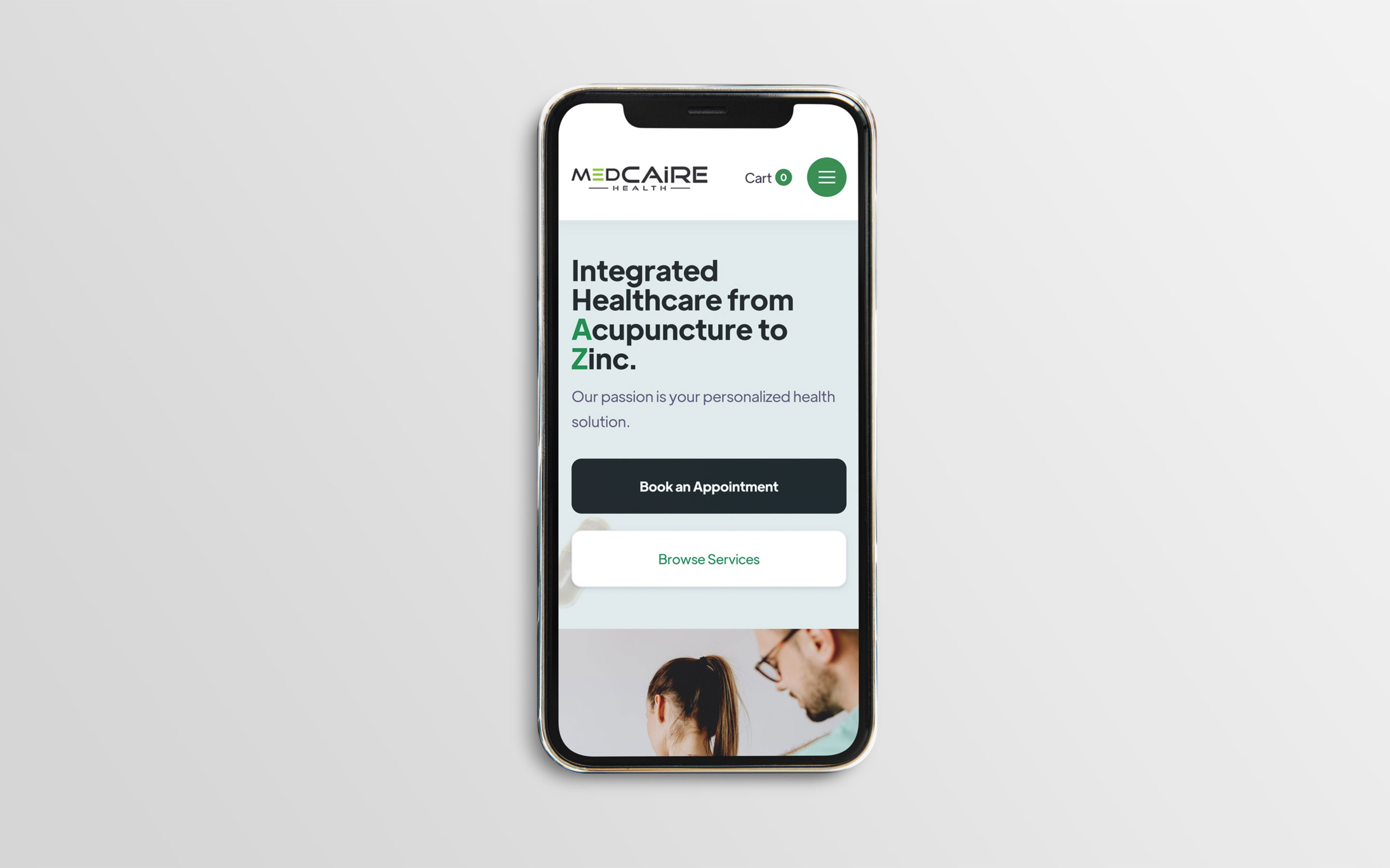
This informed the core messaging shift. The hero statement, “Integrated Healthcare from Acupuncture to Zinc”, was developed to immediately re-educate returning patients about the clinic's new capabilities, while clearly explaining the value proposition to new visitors.
Designing for approachability.
MedCAiRE’s new visual direction required stripping away the heavy, high-contrast tropes of sports rehab. I replaced them with a restorative, low-tension design system.
The visual language leans on a grounded colour palette: soft sage, deep forest green, and off-white. Typography was updated to be highly legible and direct, giving the brand a tone that is professional and reassuring without feeling sterile. The imagery shifted away from intense physical exertion toward moments of care, consultation, and relief.
This system was designed to flex. It provided a cohesive visual wrapper that could make a highly clinical service like an IV drip feel just as approachable as a standard massage.
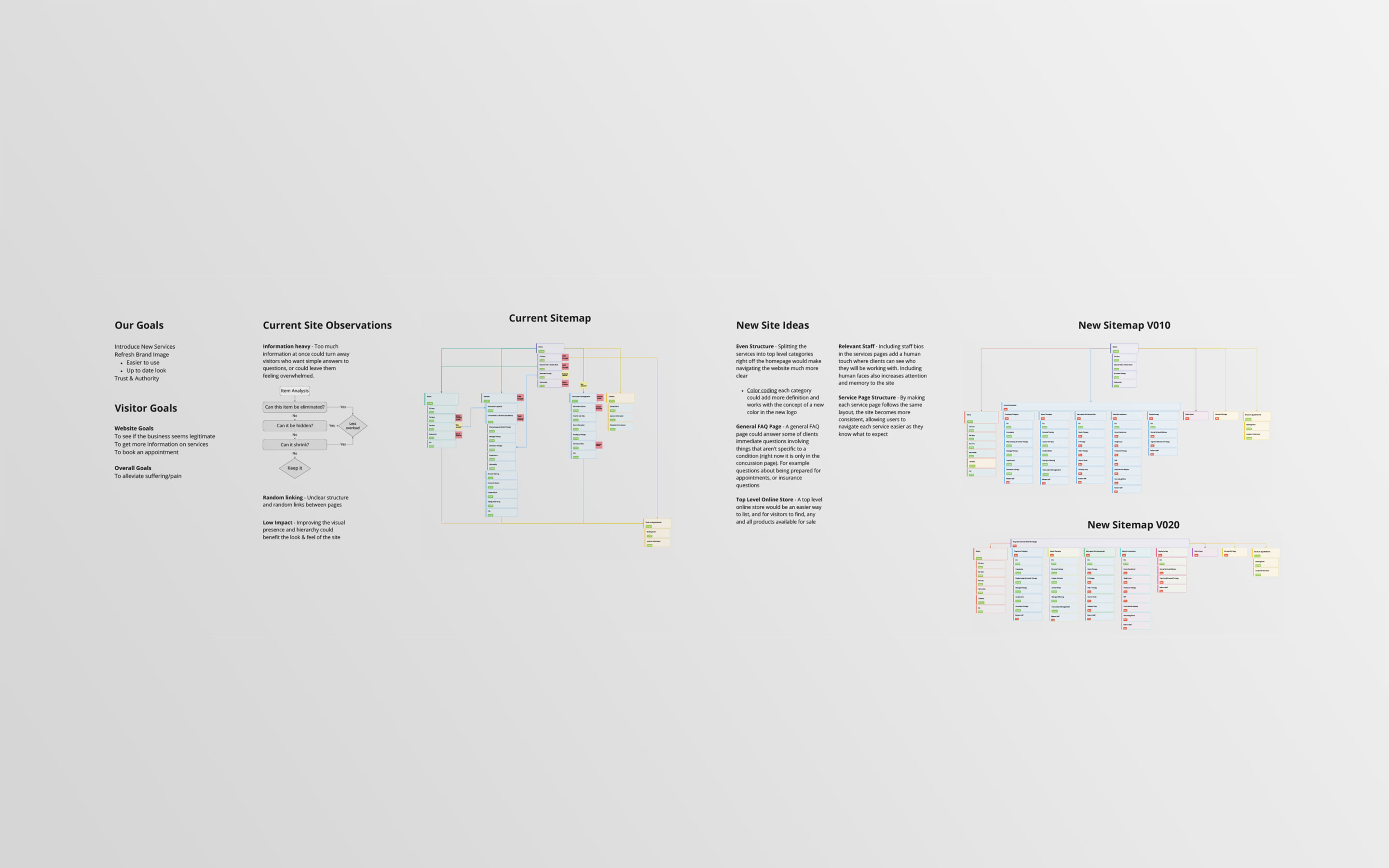
Structuring the Digital Clinic
Making complex healthcare navigable.
Before this pivot, a patient might visit the site knowing exactly what they needed. After the pivot, the website had to do the heavy lifting of educating the patient on what treatments were actually available to them.
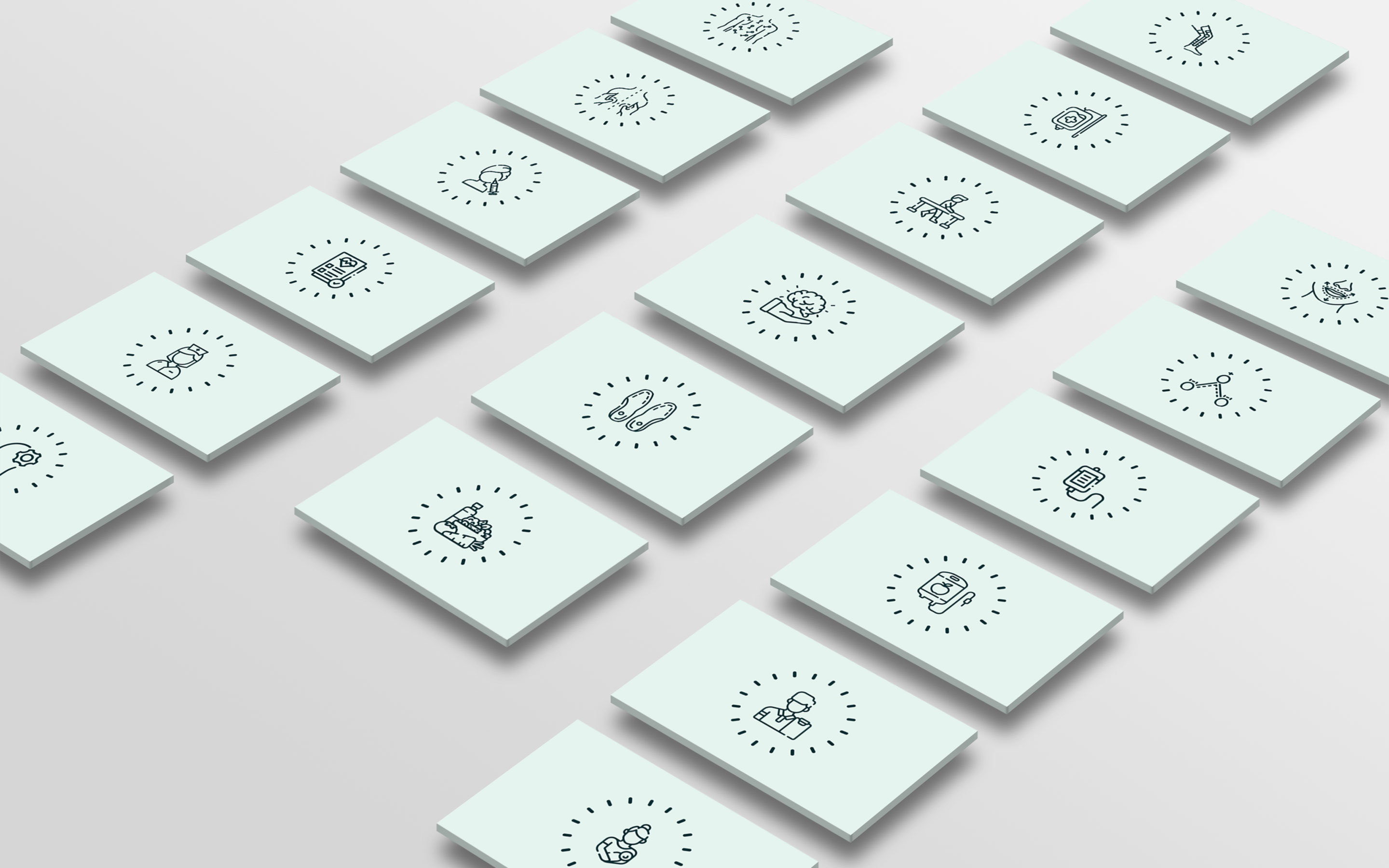
The new website was built as a modular triage system. We took dense, complex medical information and broke it down into a clean, easily scannable grid. Services were categorized with custom iconography, allowing users to browse by treatment type visually rather than reading through heavy medical text.
Each service page (such as IV Infusion Therapy) was structured to answer immediate patient anxieties: What is it? What are the benefits? What should I expect? By standardizing how information was presented across dozens of distinct services, we drastically reduced the friction of learning about new treatments.
What Changed
MedCAiRE gained more than an updated website. The work helped turn a specialized sports clinic into a scalable, full-spectrum healthcare destination.
The project created a stronger structural foundation for the clinic’s growth:
A softer, more inclusive brand position that appeals to a broader demographic.
A restorative visual language grounded in approachability and clinical trust.
A modular website architecture capable of housing a massive roster of diverse services.
Clearer patient routing and service discovery.
Integrated booking flows that reduce friction between education and conversion.
MedCAiRE’s expansion required design to operate as a tool for clarity. By reorganizing the clinic's digital presence and softening its visual identity, the brand is now equipped to handle its growing capabilities without leaving any patients behind.
From the journal
Don't Treat Launch as the Finish Line
Jan-Philip Radde
May 21, 2026
6 min
Don't Treat Launch as the Finish Line
The common expectation of design is that things should last forever. They should be solid and resist the natural decay that affects everything. We are trained to design against time, aiming for a fixed state. When a client approaches a studio, mine or anyone else's, the instinct is to forge something immutable, a digital monument. That is the wrong instinct, we must design for change, the only constant is change. Climate, technology, geopolitical dynamics, and, most importantly, the user's needs, they are all in relentless flux. To design for permanence is to create an immediately outdated product, one that is perfectly suited to yesterday’s conditions and becomes increasingly obsolete with every passing hour. We need to shift our design approach. Instead of creating static artifacts, we should be curating dynamic systems. Our focus should be on longevity achieved not through resistance, but through adaptability.
Working with Trades: Bridging the Gap Between Design and Craft
Jan-Philip Radde
May 21, 2026
3 min
Working with Trades: Bridging the Gap Between Design and Craft
In the world of graphic and web design, collaboration is at the heart of every successful project. Yet, when designers and tradespeople come together, there’s often an invisible wall built from years of assumptions, miscommunications, and missed opportunities. Having worked across disciplines and industries, I’ve seen firsthand how these barriers can be transformed into bridges if both sides are willing to listen, learn, and translate.
Understanding the Divide:
Designers and trades have long held certain perceptions about each other. Designers may see trades as rigid or overly practical, while trades might view designers as abstract or disconnected from the realities of building and making. These stigmas are rarely accurate, but they persist because both sides speak different languages, one rooted in abstract aesthetics and vision, the other in pragmatic materials and execution.
The Power of Translation:
The trades operate on efficiency, trust, and tangibility. Our designs must reflect those same core values, but through a different medium. When a designer talks about "visual hierarchy," the translation for a builder is "clear, immediate identification of critical information." When we discuss "negative space," the conversation should shift to "clarity" and "reduction of mental load," the immediate ability of a potential client to locate the service or product they need without unnecessary friction.
This translation isn’t about compromise; it’s about synthesis. It’s about finding the intersection where design vision meets practical expertise. When both sides are invested in the outcome, the result is work that is not only beautiful but also functional, durable, and innovative.
Communicating Value:
One of the most important aspects of working with trades is communicating the value of design. Instead of justifying or defending your work, focus on clearly showcasing its tangible value. Show how thoughtful design can make a process more efficient, a product more desirable, or a space more intuitive.
Mutual Benefit and Opportunity:
When designers and trades collaborate effectively, the benefits are real and measurable. Projects run more smoothly, budgets are respected, and the end product often exceeds expectations. More importantly, these partnerships can open up new avenues for business and creativity. Trades gain access to new markets and ideas, while designers learn to ground their visions in reality, making their work more impactful.
Moving Forward Together:
The future of design is collaborative. By breaking down the old stigmas and focusing on translation and communication, designers and trades can create work that is greater than the sum of its parts. The process becomes not just lucrative but deeply rewarding for everyone involved.
The Discipline of Constraint: Quality Design on a Lean Budget
Jan-Philip Radde
May 21, 2026
6 min
The Discipline of Constraint: Quality Design on a Lean Budget
In the design industry, the low-budget client is often regarded with a certain dread, a potential vector for scope creep, compromised aesthetics, and ultimately, a dilution of a studio's core quality standards. This perspective is understandable, yet fundamentally flawed. It presupposes that financial constraint is inherently antithetical to design excellence. It is not. It is merely a specific, potent form of constraint, and constraint, properly leveraged, is the engine of genuine innovation. Decoding the Scope: The Essential vs. The Superficial: The first and most critical step when engaging a low-budget project is the absolute clarity of scope. High-budget projects often tolerate a certain degree of feature bloat or aesthetic indulgence. A lean budget provides no such margin. We must immediately strip the project down to its functional core.


.jpg)