Commercial landscaping and snow removal is rarely about aesthetics. For the developers, institutional clients, and property managers that Tolias serves, it is an exercise in liability mitigation and operational uptime. They require high-value sites to remain functional, compliant, and safe across harsh winters and complex built environments.
The objective of this rebrand was to shift Tolias away from the visual tropes of a standard contractor and position them as a highly disciplined, systemic operator. Although the project was ultimately halted before implementation, the strategic foundation and visual exploration demonstrate a rigorous approach to translating operational reliability into brand architecture.
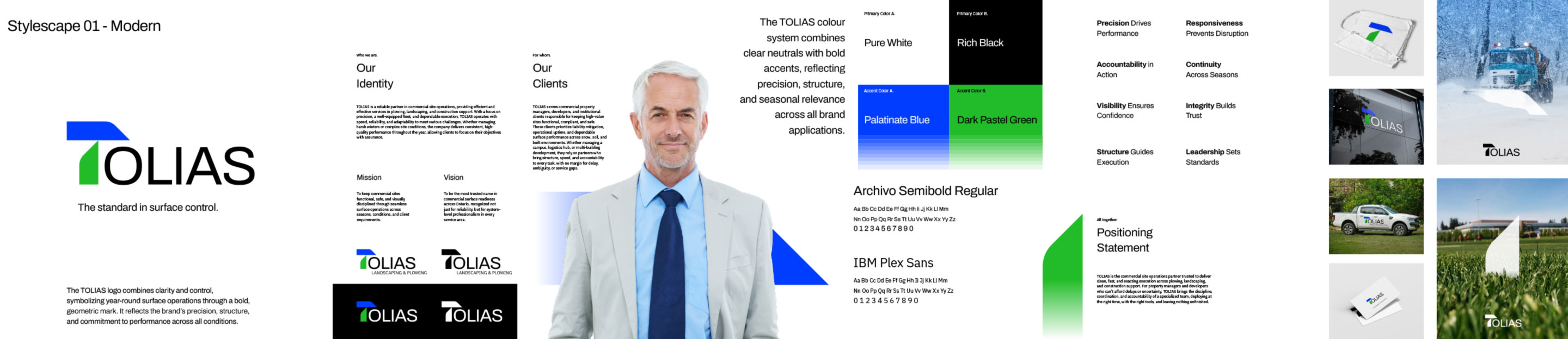
Defining the Standard
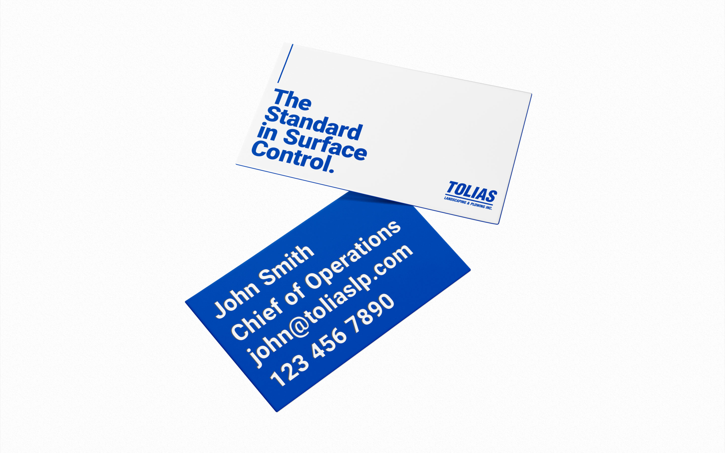
Before any design work began, the core positioning was defined: “The standard in surface control”.
The strategy framed Tolias as a partner providing "system-level professionalism". The messaging bypassed generic promises of quality, focusing instead on themes crucial to property developers: speed, accountability, and the absolute elimination of service gaps or delays. This operational ethos was distilled into core brand pillars, including "Precision Drives Performance," "Responsiveness Prevents Disruption," and "Continuity Across Seasons".
To visualize this positioning, two distinct conceptual directions, Stylescapes, were developed to test different market postures.
Concept 01: Modern Precision
The first direction explored a highly structural, corporate aesthetic.
The Mark: A bold, geometric logo was designed to symbolize clarity, control, and year-round operations, derived from grass and snowplow blades.
Typography: The structural nature of the brand was reinforced using the clean, modern letterforms of Archivo Semibold and IBM Plex Sans.
Palette: A highly controlled color system combining neutral Pure White and Rich Black with stark accents of Palatinate Blue and Dark Pastel Green.
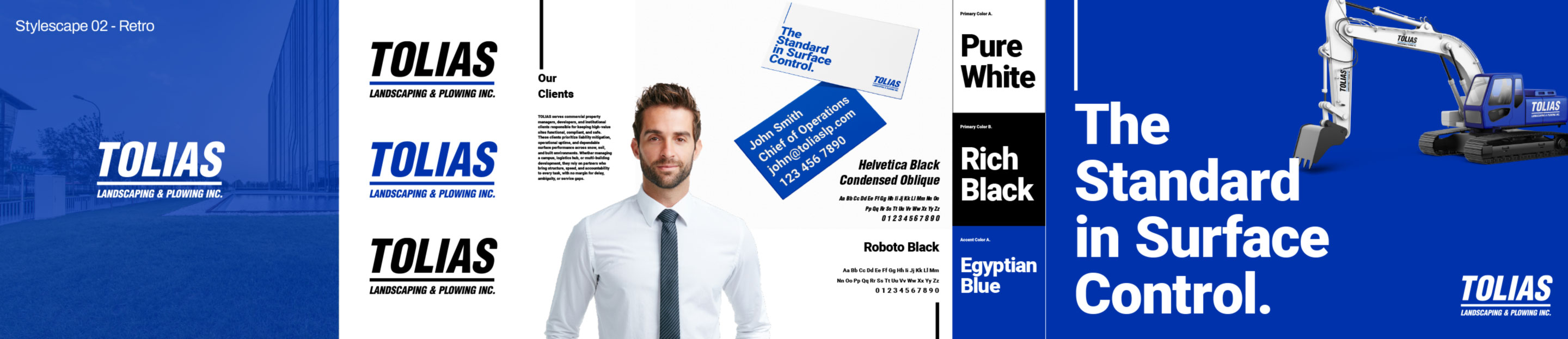
Concept 02: Retro Authority
The second direction tested a more industrial, legacy-driven visual language, leaning into the utilitarian roots of heavy site operations.
The Mark: This concept utilized a heavy, commanding badge aesthetic for the "TOLIAS LANDSCAPING & PLOWING INC." wordmark.
Typography: The typography shifted to aggressive, high-impact industrial weights, utilizing Helvetica Black Condensed Oblique and Roboto Black.
Palette: The color system was simplified to high-contrast Pure White and Rich Black, anchored by a single, bold Egyptian Blue accent.
The Blueprint
While the visual identity remains an unlaunched concept, the strategic groundwork successfully codified the company's mission: to keep commercial sites functional, safe, and visually disciplined through relentless surface operations. The exploration proves that even in highly utilitarian industries, rigorous design thinking can elevate a service from a seasonal vendor to an indispensable operational partner.
From the journal
Don't Treat Launch as the Finish Line
Jan-Philip Radde
May 21, 2026
6 min
Don't Treat Launch as the Finish Line
The common expectation of design is that things should last forever. They should be solid and resist the natural decay that affects everything. We are trained to design against time, aiming for a fixed state. When a client approaches a studio, mine or anyone else's, the instinct is to forge something immutable, a digital monument. That is the wrong instinct, we must design for change, the only constant is change. Climate, technology, geopolitical dynamics, and, most importantly, the user's needs, they are all in relentless flux. To design for permanence is to create an immediately outdated product, one that is perfectly suited to yesterday’s conditions and becomes increasingly obsolete with every passing hour. We need to shift our design approach. Instead of creating static artifacts, we should be curating dynamic systems. Our focus should be on longevity achieved not through resistance, but through adaptability.
Working with Trades: Bridging the Gap Between Design and Craft
Jan-Philip Radde
May 21, 2026
3 min
Working with Trades: Bridging the Gap Between Design and Craft
In the world of graphic and web design, collaboration is at the heart of every successful project. Yet, when designers and tradespeople come together, there’s often an invisible wall built from years of assumptions, miscommunications, and missed opportunities. Having worked across disciplines and industries, I’ve seen firsthand how these barriers can be transformed into bridges if both sides are willing to listen, learn, and translate.
Understanding the Divide:
Designers and trades have long held certain perceptions about each other. Designers may see trades as rigid or overly practical, while trades might view designers as abstract or disconnected from the realities of building and making. These stigmas are rarely accurate, but they persist because both sides speak different languages, one rooted in abstract aesthetics and vision, the other in pragmatic materials and execution.
The Power of Translation:
The trades operate on efficiency, trust, and tangibility. Our designs must reflect those same core values, but through a different medium. When a designer talks about "visual hierarchy," the translation for a builder is "clear, immediate identification of critical information." When we discuss "negative space," the conversation should shift to "clarity" and "reduction of mental load," the immediate ability of a potential client to locate the service or product they need without unnecessary friction.
This translation isn’t about compromise; it’s about synthesis. It’s about finding the intersection where design vision meets practical expertise. When both sides are invested in the outcome, the result is work that is not only beautiful but also functional, durable, and innovative.
Communicating Value:
One of the most important aspects of working with trades is communicating the value of design. Instead of justifying or defending your work, focus on clearly showcasing its tangible value. Show how thoughtful design can make a process more efficient, a product more desirable, or a space more intuitive.
Mutual Benefit and Opportunity:
When designers and trades collaborate effectively, the benefits are real and measurable. Projects run more smoothly, budgets are respected, and the end product often exceeds expectations. More importantly, these partnerships can open up new avenues for business and creativity. Trades gain access to new markets and ideas, while designers learn to ground their visions in reality, making their work more impactful.
Moving Forward Together:
The future of design is collaborative. By breaking down the old stigmas and focusing on translation and communication, designers and trades can create work that is greater than the sum of its parts. The process becomes not just lucrative but deeply rewarding for everyone involved.
The Discipline of Constraint: Quality Design on a Lean Budget
Jan-Philip Radde
May 21, 2026
6 min
The Discipline of Constraint: Quality Design on a Lean Budget
In the design industry, the low-budget client is often regarded with a certain dread, a potential vector for scope creep, compromised aesthetics, and ultimately, a dilution of a studio's core quality standards. This perspective is understandable, yet fundamentally flawed. It presupposes that financial constraint is inherently antithetical to design excellence. It is not. It is merely a specific, potent form of constraint, and constraint, properly leveraged, is the engine of genuine innovation. Decoding the Scope: The Essential vs. The Superficial: The first and most critical step when engaging a low-budget project is the absolute clarity of scope. High-budget projects often tolerate a certain degree of feature bloat or aesthetic indulgence. A lean budget provides no such margin. We must immediately strip the project down to its functional core.


.jpg)