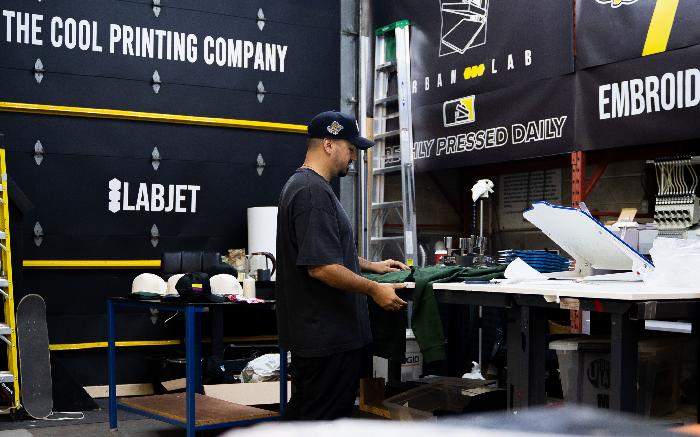
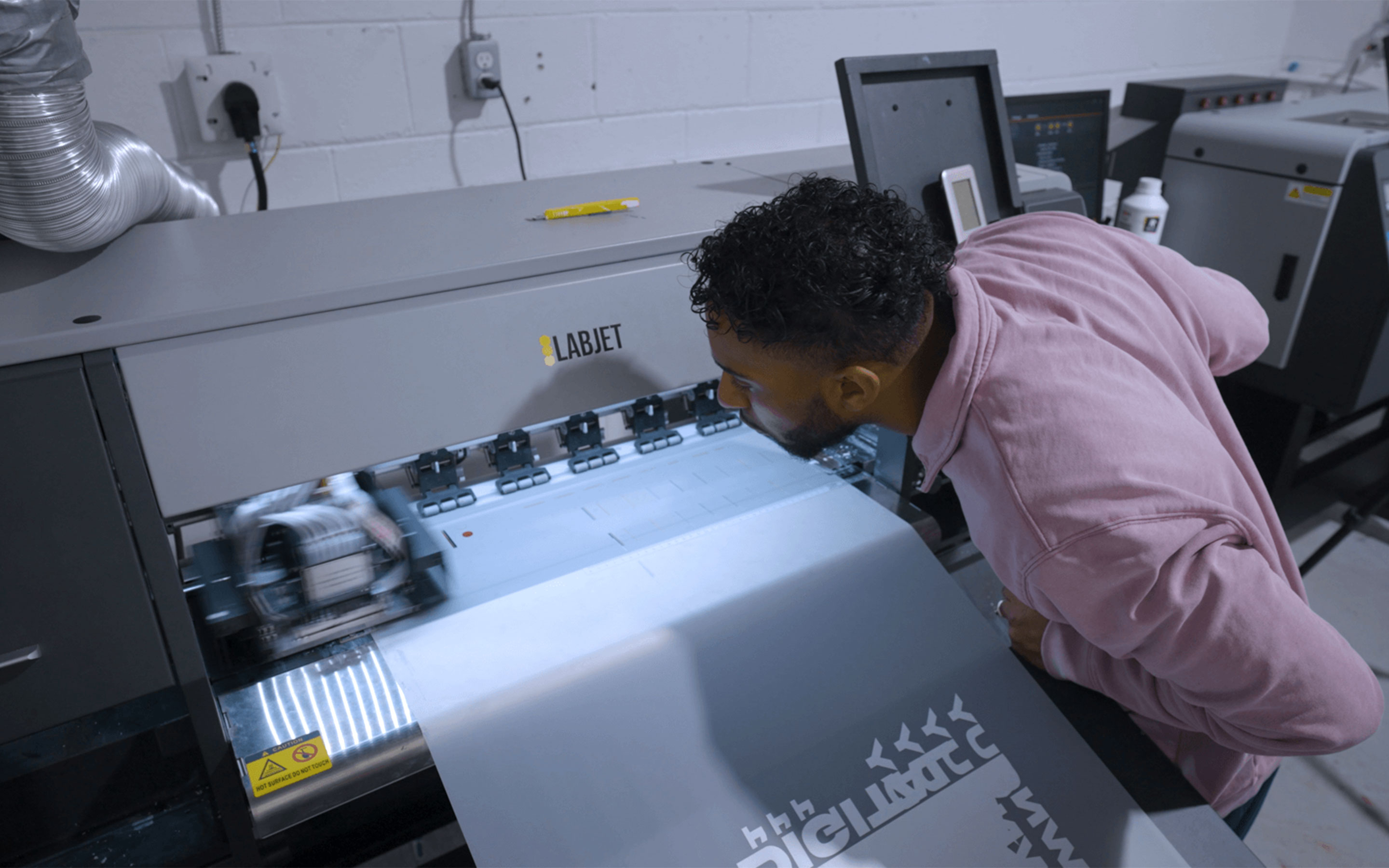
URBAN LAB began with a single heat press and vinyl cutter in a basement. Since then, it has grown into a production partner for local businesses, cultural clients, and major names including Amazon, Universal Music, Steam Whistle, Pearson International and OVO.
I have been involved with the brand since before its launch, shaping its original identity, later rebrands, website direction, service structure, and operational systems as the business grew. The work was never only about making URBAN LAB look more polished. It was about helping the company become clearer, more recognizable, and more structurally prepared for the scale of work it was beginning to take on.
Over time, the project became a long-term design partnership: building the public face of the company while also helping structure the systems behind it.
The Strategic Frame
A brand that had to grow with the business.
URBAN LAB’s identity could not be treated as a static logo exercise. The business was changing quickly: new equipment, new services, larger clients, more complex orders, and a wider mix of customer types. A brand system had to support that growth without losing the direct, hands-on energy that made the company work in the first place.
The challenge was to build a brand that could hold several roles at once: a local print shop, a custom apparel partner, a production resource for small businesses, and a creative collaborator for fashion and design clients.
That meant the work had to move across three layers:
Identity
Creating a visual and verbal system that made URBAN LAB recognizable.
Commerce
Structuring the website and service experience so customers could understand what was available and how to start.
Operations
Building internal tools and workflows that helped the team manage quoting, intake, production, and service complexity.
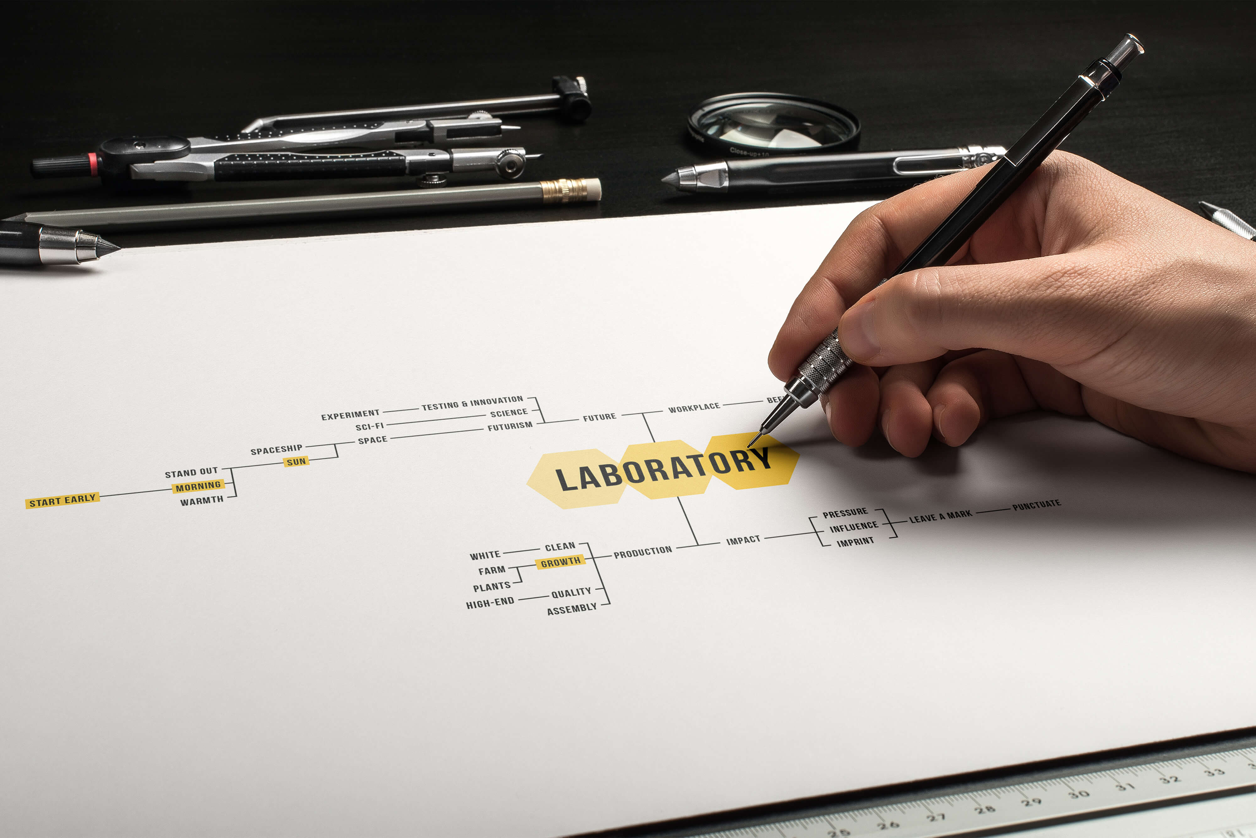
Behind the Brand
The main rebrand began with a founder workshop. Rather than starting with a moodboard, the process started by mapping the company’s internal language: what the founders wanted URBAN LAB to become, how they described the work, what ideas felt native to the business, and what associations kept recurring.
One central idea emerged: the laboratory.
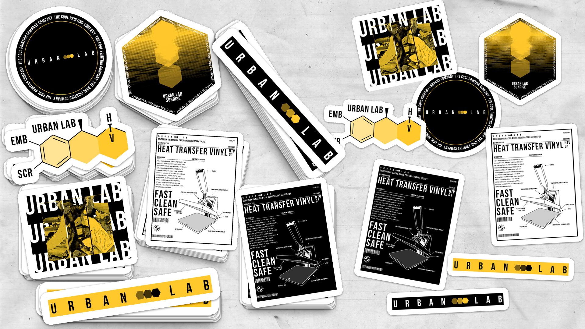
The concept connected directly to the name URBAN LAB, but it also gave the brand a deeper internal logic. A laboratory suggests experimentation, production, testing, systems, precision, and discovery. From there, the visual language began to form through association: bees, hives, hexagons, honey, yellow, light, work, communication, and modular structure.
The result was a way to translate the founders’ instincts into a visual and verbal system the company could keep building on.
Early concept mapping from the rebrand process, connecting founder language to visual motifs.
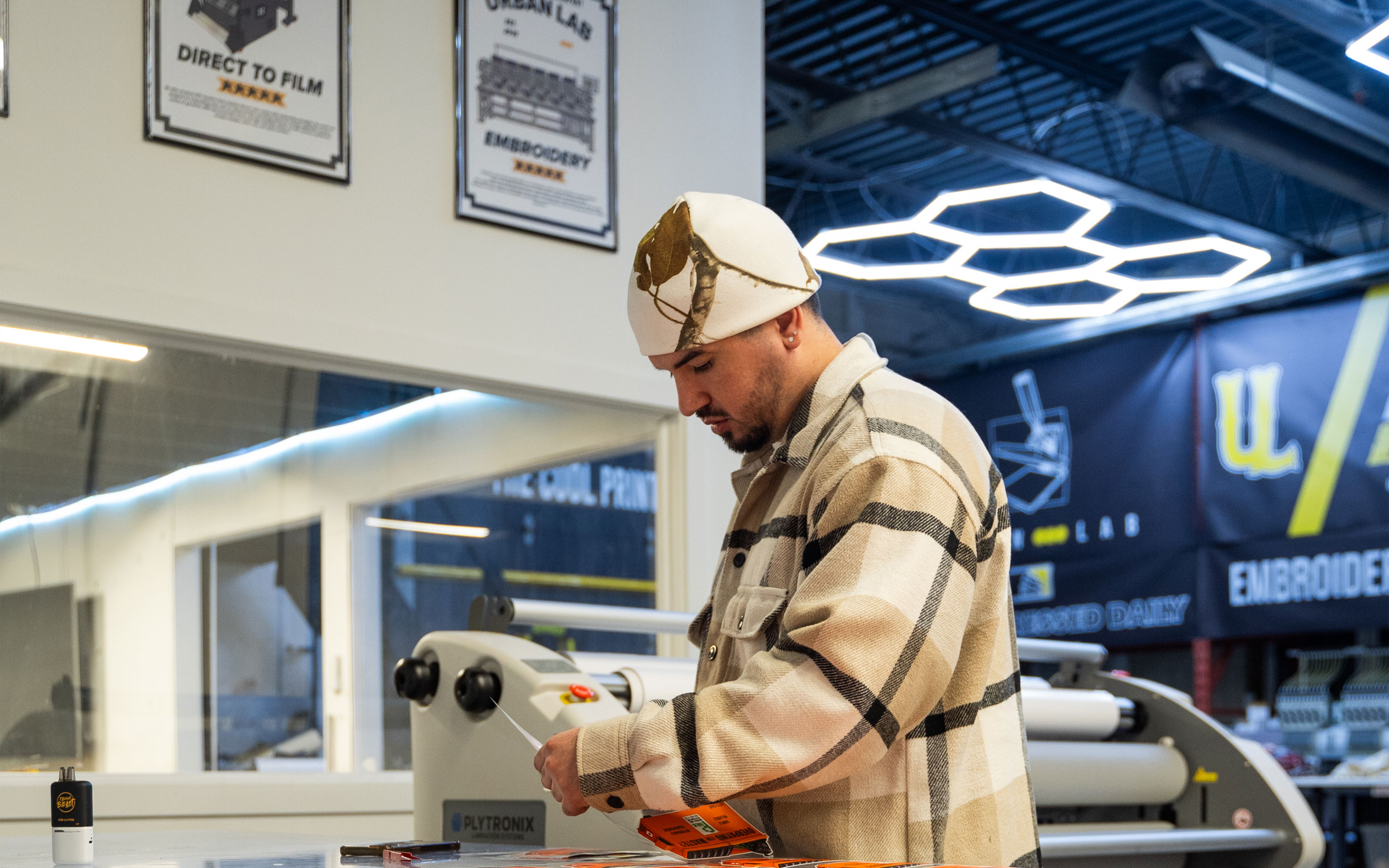
The Brand System
Making the shop recognizable.
URBAN LAB’s brand direction developed around a simple tension: it needed to feel practical enough for production work, but sharper than the average local print shop. The visual language used yellow, black, modular geometry, direct typography, and production-led imagery to create a brand that felt industrial, energetic, and approachable.
The phrase “The Cool Printing Company” became a useful shorthand for that positioning. It gave the business a tone that was confident without becoming corporate, casual without becoming sloppy, and design-aware without alienating practical customers.
This system could then stretch across apparel, signage, business cards, social content, web pages, service graphics, and internal documents.
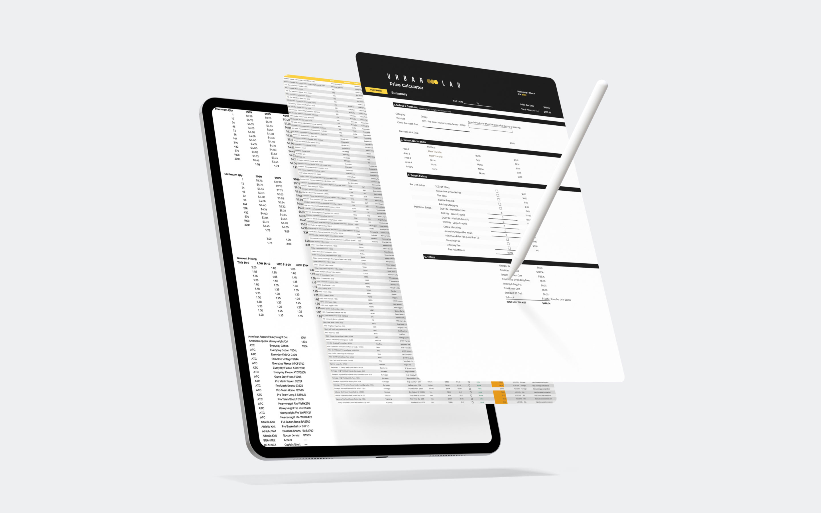
Prototyping the order path.
Before the Shopify build, I was already working on two related pieces: URBAN LAB’s informational website and a price calculator tool. The website explained what the company offered. The calculator allowed the team to quickly quote inquiries that came in.
Together, they exposed the larger opportunity. URBAN LAB did not only need a website, and it did not only need a quoting tool. It needed a more unified digital system: one that could educate customers, organize services, guide product selection, support custom decoration, and move people closer to ordering.
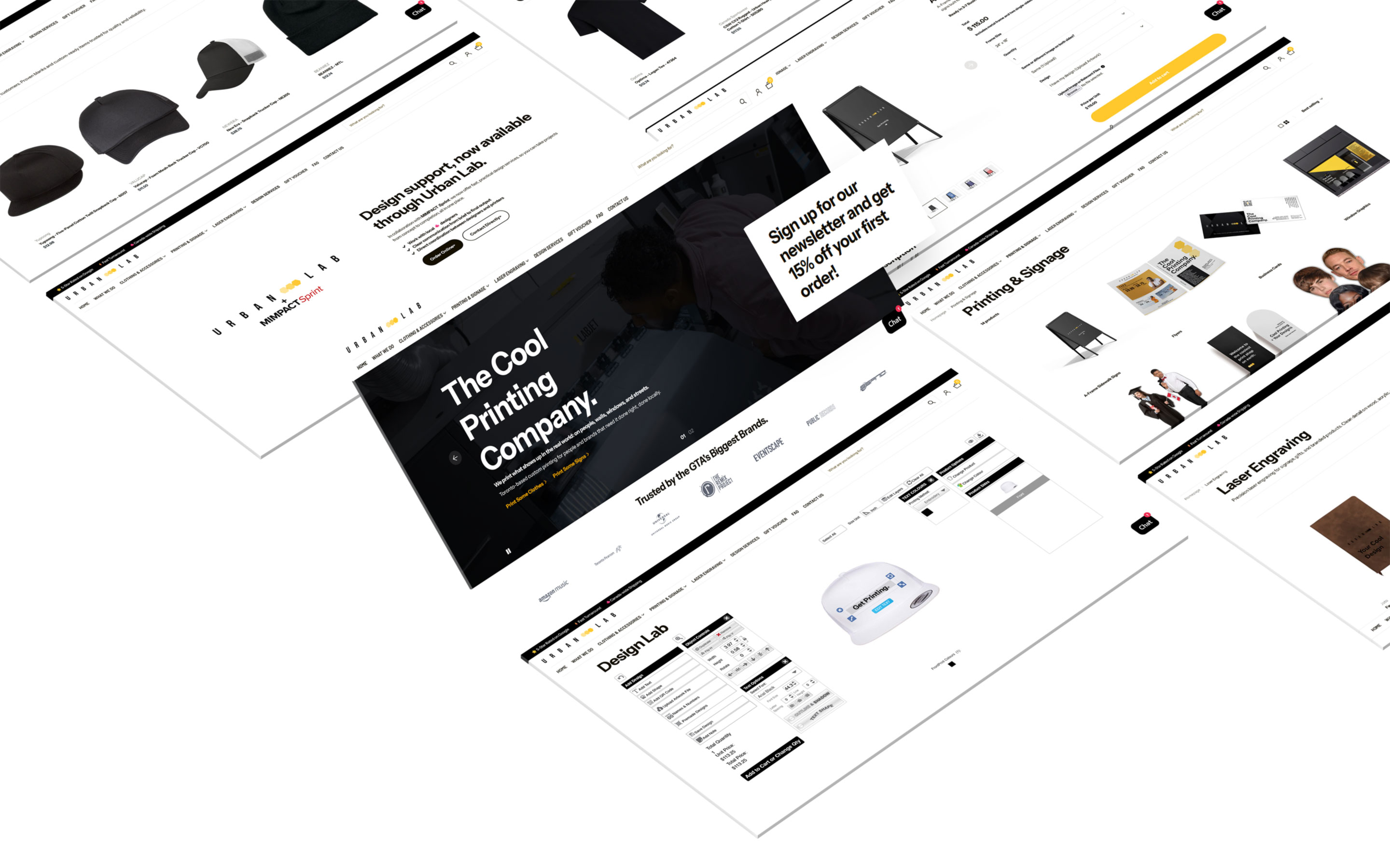
URBAN LAB 2.0: Making Custom Print Self-Serve
From website to commerce system.
The insight from the pricing calculator and earlier website work led to URBAN LAB 2.0: a Shopify-based system designed to let customers browse products, choose blanks, upload artwork, customize designs, understand decoration options, and place orders without needing to start through a traditional inquiry form or contacting the team.
The site was structured around the real ways people approach the business. The challenge was to make a complex service business feel navigable without flattening the details that matter in production.
The site became a customer-facing service system: part catalogue, part education layer, part intake path, and part brand expression.
Operations Layer
Designing the business behind the brand.
As the company grew, the operational side became as important as the visual identity. Custom production creates constant judgment calls: pricing, decoration method, garment type, artwork quality, turnaround time, approvals, file handling, and production scheduling.
Many of those decisions originally lived informally in the team’s heads. The work became about turning that knowledge into tools, workflows, and repeatable structures.
That included quoting systems, pricing matrices, order tracking, financial tools, ClickUp workflows, internal documentation, and process maps that helped the team manage jobs with more clarity.
This was design in a broader sense: not just shaping how the brand looked, but shaping how the business understood and handled its own work.
Longitudinal Growth
What Changed
URBAN LAB gained more than a visual identity. The work helped turn a small production setup into a clearer brand and service system: one that could be recognized publicly, navigated by customers, and supported internally.
The project created a stronger foundation across the business:
a more distinctive brand position
a clearer visual and verbal language
a more structured Shopify website
better organization of services and customer entry points
quoting and pricing systems for custom work
internal order-tracking and workflow tools
a brand direction that could grow with the company rather than be replaced each time the business changed
URBAN LAB’s growth required design to operate at different levels. At first, the work was about identity: giving the company a recognizable face. As the business expanded, the work moved into structure: how services were explained, how customers entered the system, how internal decisions were organized, and how the brand could remain coherent across more touchpoints.
This is what makes the project strong. The brand was not built once and left alone. It was shaped, tested, revised, and extended as the company grew.
From the journal
Don't Treat Launch as the Finish Line
Jan-Philip Radde
May 21, 2026
6 min
Don't Treat Launch as the Finish Line
The common expectation of design is that things should last forever. They should be solid and resist the natural decay that affects everything. We are trained to design against time, aiming for a fixed state. When a client approaches a studio, mine or anyone else's, the instinct is to forge something immutable, a digital monument. That is the wrong instinct, we must design for change, the only constant is change. Climate, technology, geopolitical dynamics, and, most importantly, the user's needs, they are all in relentless flux. To design for permanence is to create an immediately outdated product, one that is perfectly suited to yesterday’s conditions and becomes increasingly obsolete with every passing hour. We need to shift our design approach. Instead of creating static artifacts, we should be curating dynamic systems. Our focus should be on longevity achieved not through resistance, but through adaptability.
Working with Trades: Bridging the Gap Between Design and Craft
Jan-Philip Radde
May 21, 2026
3 min
Working with Trades: Bridging the Gap Between Design and Craft
In the world of graphic and web design, collaboration is at the heart of every successful project. Yet, when designers and tradespeople come together, there’s often an invisible wall built from years of assumptions, miscommunications, and missed opportunities. Having worked across disciplines and industries, I’ve seen firsthand how these barriers can be transformed into bridges if both sides are willing to listen, learn, and translate.
Understanding the Divide:
Designers and trades have long held certain perceptions about each other. Designers may see trades as rigid or overly practical, while trades might view designers as abstract or disconnected from the realities of building and making. These stigmas are rarely accurate, but they persist because both sides speak different languages, one rooted in abstract aesthetics and vision, the other in pragmatic materials and execution.
The Power of Translation:
The trades operate on efficiency, trust, and tangibility. Our designs must reflect those same core values, but through a different medium. When a designer talks about "visual hierarchy," the translation for a builder is "clear, immediate identification of critical information." When we discuss "negative space," the conversation should shift to "clarity" and "reduction of mental load," the immediate ability of a potential client to locate the service or product they need without unnecessary friction.
This translation isn’t about compromise; it’s about synthesis. It’s about finding the intersection where design vision meets practical expertise. When both sides are invested in the outcome, the result is work that is not only beautiful but also functional, durable, and innovative.
Communicating Value:
One of the most important aspects of working with trades is communicating the value of design. Instead of justifying or defending your work, focus on clearly showcasing its tangible value. Show how thoughtful design can make a process more efficient, a product more desirable, or a space more intuitive.
Mutual Benefit and Opportunity:
When designers and trades collaborate effectively, the benefits are real and measurable. Projects run more smoothly, budgets are respected, and the end product often exceeds expectations. More importantly, these partnerships can open up new avenues for business and creativity. Trades gain access to new markets and ideas, while designers learn to ground their visions in reality, making their work more impactful.
Moving Forward Together:
The future of design is collaborative. By breaking down the old stigmas and focusing on translation and communication, designers and trades can create work that is greater than the sum of its parts. The process becomes not just lucrative but deeply rewarding for everyone involved.
The Discipline of Constraint: Quality Design on a Lean Budget
Jan-Philip Radde
May 21, 2026
6 min
The Discipline of Constraint: Quality Design on a Lean Budget
In the design industry, the low-budget client is often regarded with a certain dread, a potential vector for scope creep, compromised aesthetics, and ultimately, a dilution of a studio's core quality standards. This perspective is understandable, yet fundamentally flawed. It presupposes that financial constraint is inherently antithetical to design excellence. It is not. It is merely a specific, potent form of constraint, and constraint, properly leveraged, is the engine of genuine innovation. Decoding the Scope: The Essential vs. The Superficial: The first and most critical step when engaging a low-budget project is the absolute clarity of scope. High-budget projects often tolerate a certain degree of feature bloat or aesthetic indulgence. A lean budget provides no such margin. We must immediately strip the project down to its functional core.


.jpg)